Joined: Jan 18, 2009
Posts: 37
Location: Vancouver, Canada
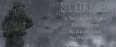
Admittedly, I haven't even looked at- nevermind used- photoshop in over a year and a half, so this started more as an experiment in relieving boredom than anything else. Actually, it was only after I'd sunk four hours into it that I thought I might as well actually use it for something.
So on that note, any suggestions?

PS: Aside from some slight cropping, that is.
Last edited by Sturmen on Sat Feb 07, 2009 10:25 pm; edited 2 times in total
Joined: Jan 28, 2009
Posts: 391
Location: Sherwood, Arkansas
Joined: Jul 12, 2007
Posts: 13676
hey sturmen ye steel is right we try to limit height of sigs and the width to prevent to much scrolling, but you could try making it wider and take some of the height but apart from that it look great and nice saying

It is Going To Hurt
http://taylormadehosting.co.uk
Joined: Jan 29, 2009
Posts: 22
Testing my sig. My gf made it last night. The picture and colors were her idea, the teddy and saying was mine.
I like yours btw, but the text is a little light. I had a hard time reading it.
